
Website redesign & replatform · No Greater Sacrifice Foundation
A site worthy of the families it serves.
No Greater Sacrifice funds debt-free education for the children of fallen and severely wounded service members. Its website had fallen years behind the organization. It understated the reach, buried the evidence, and made grieving families hunt for the one page that said whether they qualified. We rebuilt it in 90 days.
- Partner schools, where the old site said 135
- 350+
- More appearances in search, first 30 days
- +40%
- Accessibility errors — audited 100 / 100
- Zero
What the site carries
Two people, two decisions.
A parent arrives after the worst thing that will ever happen to their family, trying to learn whether their child qualifies for a scholarship. A donor arrives wanting to know what a gift actually buys. The site has one job for each of them, and the old one served neither well.
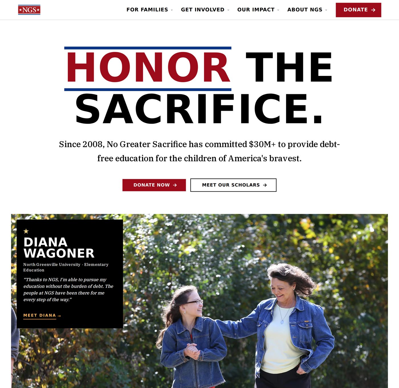
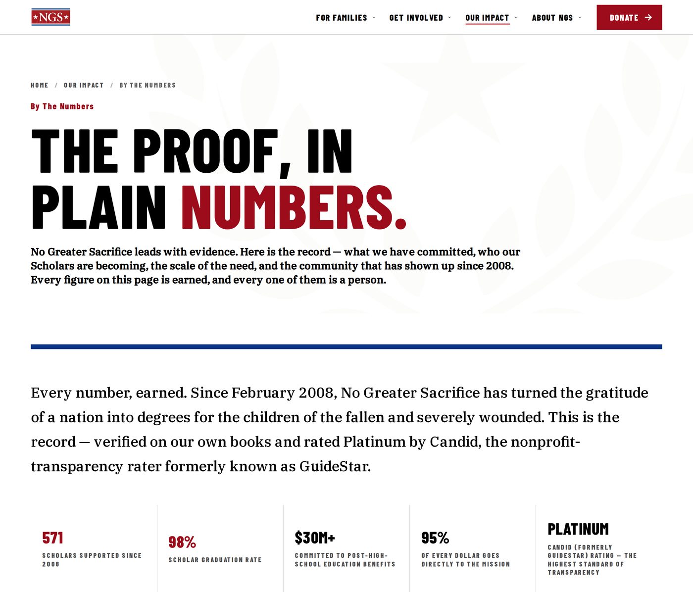
Since 2008, No Greater Sacrifice has committed more than $30 million to 571 Scholars at over 350 colleges and trade schools — debt-free, every one. None of that scale was legible on the website that represented it.
Where we started
What the audit found.
Before any design began, we audited the site across five dimensions: navigation, visual design, content, technical foundations and audience alignment.
The finding that mattered most was that only one of those two visitors was being addressed. The nav offered How to Help — donate, sponsor, partner — and Who We Help, which opened: “Learn more about each of our scholars … and how your contributions can help them achieve those goals.” Even the section about families was written to donors.
None of it was neglect. NGS runs lean, and updates happened when a volunteer had a free evening.
- Scholar stories three clicks deep, with names that appeared only on hover.
- The Freedom’s Future Report filed under Financial Information.
- Impact numbers scattered, with no one place that showed the record.
- Mobile rated poor; credibility markers buried in the footer.

What changed
Evidence, brought to the surface.
The impact report became a place, not a download.
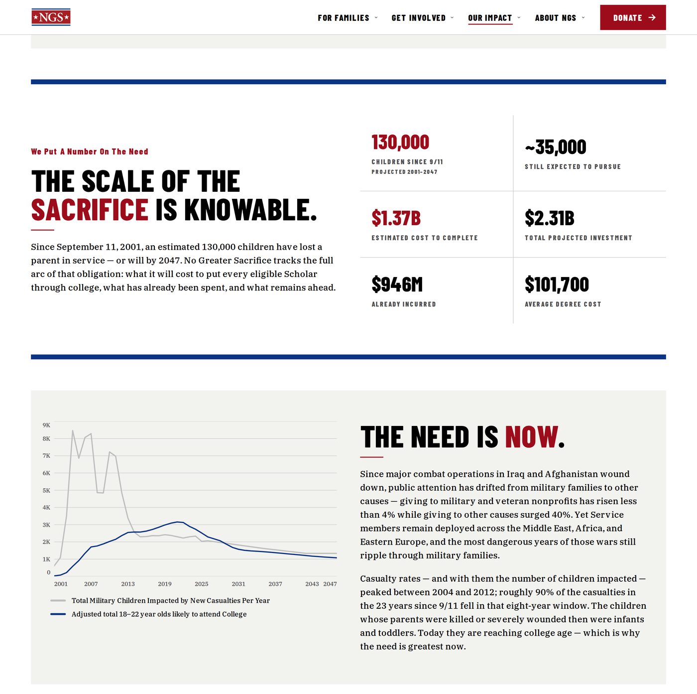
The Freedom’s Future Report had been a PDF. It is now part of the site: 130,000 children projected to lose a parent in service since 9/11, the $1.37 billion still needed to educate every eligible Scholar, and the arithmetic behind both. A donor can read it, link to it and cite it.

Scholars are people, with pages of their own.
The legacy site had sixty Recipient profiles. There are now 64 Scholar Story pages, drawn from Salesforce and material families supply rather than maintained by hand: the service member being honored above the name, then the Scholar’s field, school and own words. Publishing is an editing job now — nine updated profiles arrived in one email in July, and all nine were live the next afternoon.
Of the seven pages that draw the most search traffic today, only one appeared in Google before the launch: the staff leadership listing. A month after, the pages Google put in front of people most often were the Scholars.
The numbers can no longer go stale.
Scholar counts, dollars committed and partner schools are read from Salesforce and rendered wherever they appear. One source, one number, every page. That is why “135 partner schools” cannot happen again.
The same discipline makes the site legible to machines. The old site’s 187 pages and 31 PDFs had no sitemap at all. The new one publishes structured data, a full sitemap and a plain-text summary, so an AI assistant answering a family’s eligibility question gives what the page gives.
Accessibility lives in the components, not in a final audit.
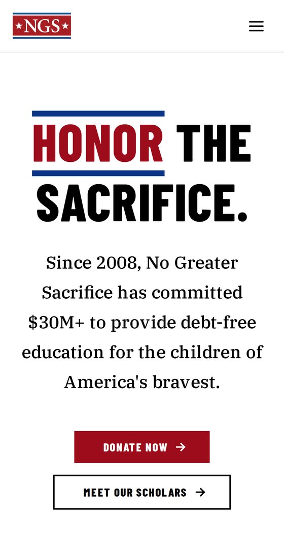
Every page is assembled from one component library, built in Storybook before page design began. WCAG 2.2 AA and Section 508 conformance is enforced on those components as a condition of shipping. The standard travels with them — to every page, and every screen size.
Thirty days after launch, an automated review of the twenty busiest pages found zero accessibility errors, and an independent audit scored every page sampled 100 / 100. Taste stayed human: a contrast fix that met the standard but cheapened the brand was rejected and redone.
How it was done in 90 days
Preparation, then a short build.
Everything NGS had written about itself
Stakeholder sessions, and a review of documents, site content and a decade of social archives. Each document was approved by a person.
Brand and components before pages
Brand guidelines and the component library came before page design, so reviews ran on working code in a browser rather than on a picture of it.
Modeled, migrated, rehearsed
Content modeled and migrated, Salesforce wired in, accessibility enforced per component, and a sixteen-step cutover rehearsed against a production copy before the switch.
People were at the wheel the whole way. Strategy, structure, words and imagery were decided by the team with NGS. Nothing reached the live site without a person approving it, and that rule still holds. What the tooling bought was iteration: draft, review and correct the same day.
The move broke nothing. All 218 legacy addresses were tested against a real copy of the new site before the switch. Every legacy PDF was recovered and re-pointed, including every Form 990.
Thirty days after launch
Found, read, and standing up.
- +40%
- more appearances in Google search than the month before launch; clicks up 28%
- 95
- search terms that now return the site and returned nothing before
- 39
- pages appearing in search results for the first time
- 54%
- engagement from search visitors, against 30% for direct traffic
- 0
- accessibility errors across the twenty busiest pages
- 0
- outages, incidents or serious security findings in month one
The page we watch most closely is Eligibility — where a family lands when they are working out whether their child qualifies. It was invisible in search before. In its first month it appeared 179 times and was clicked 29 times — roughly one in six who saw it, well above what a typical result earns.
Figures come from the project record, Google Search Console, Google Analytics and automated reviews of the live site, July 2–31, 2026, against June 1–27 on the legacy site. The “before” capture is from the Internet Archive.
“Every dollar, every minute, every word on our site is measured against one question: does this honor the families we serve? … What would have taken most organizations the better part of a year, we delivered in weeks.”
Rebekah LovornExecutive Director, No Greater Sacrifice
The site is the argument.
Meet the Scholars by name, read the report that used to be a download, and take the path a family takes.